Objective
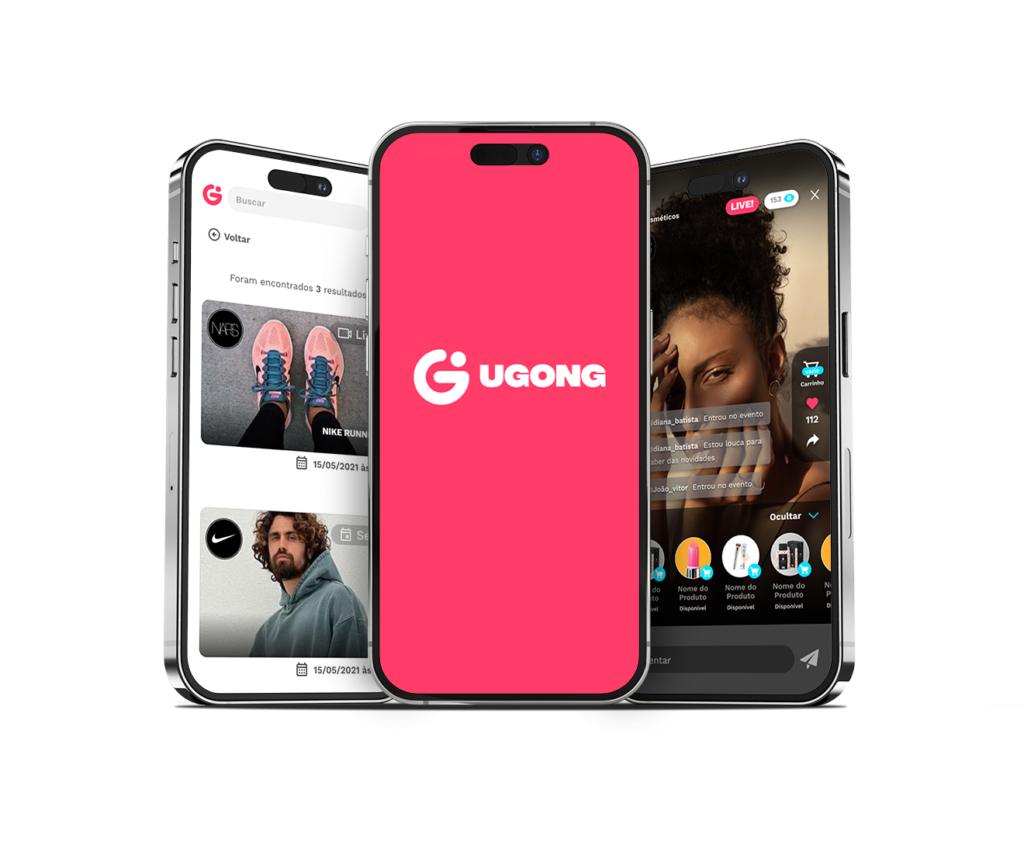
Ugong is a live commerce startup that decided to invest in a significant redesign of its user interface (UI). The challenge was to create an experience that wouldn't just meet but exceed user expectations, taking Ugong to new levels of usability.
1. Planning and Strategy
1.1 Responsive Design
Ensuring a consistent experience across every device, from desktop to mobile, the new design prioritizes accessibility and fluid adaptation.
1.2 Simplified Navigation
Optimizing the information architecture and simplifying navigation so users could easily find the products they wanted, promoting a smooth purchase journey.
1.3 Modern Aesthetic
Contemporary visual elements were introduced while preserving the Ugong brand identity. Vibrant colors, legible typography and intuitive icons were strategically incorporated to create a modern aesthetic.
1.4 Nielsen's Heuristics
Apply Nielsen's usability heuristics to evaluate the existing interface and identify heuristic violations and areas for improvement.
2. Preliminary Analysis
2.1 Live Commerce Benchmarking
- Studied successful live commerce platforms and looked for the details that stood out the most.
- Analyzed design trends, innovative features and user engagement approaches.
3. User Testing
3.1 Usability Testing
- Conducted qualitative and quantitative research with the unmodified tool, to analyze the changes to be implemented.
- Recorded feedback, adjusted the design based on the results, and repeated the tests as needed.
Live Streams Home
Shopping Cart
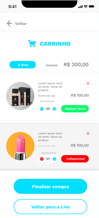
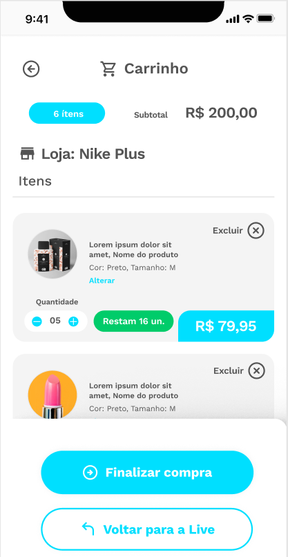
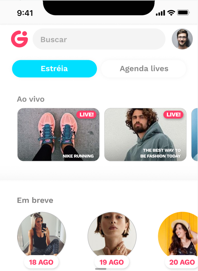
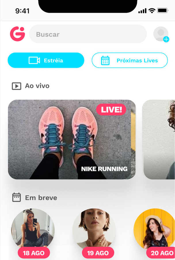
The first changes were visual: on the Live Streams Home, for example, more emphasis was given to the main live streams. In the shopping cart, as throughout the app, several screens and unnecessary navigation steps were adjusted, and icons were also added to every step and button, to ensure empathy and a proper understanding of user needs.
4. Incremental Iterations
4.1 Implementations
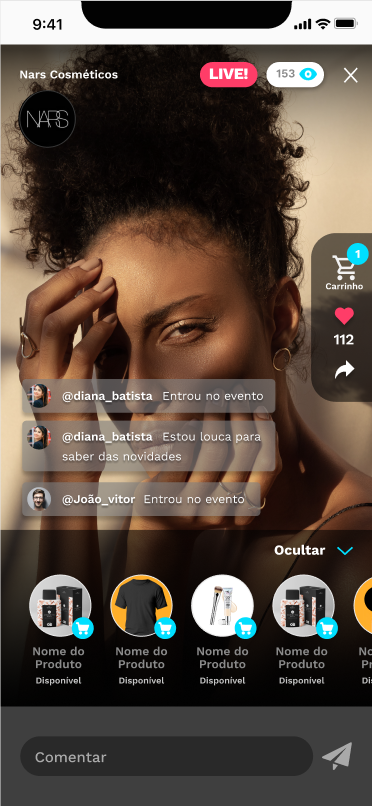
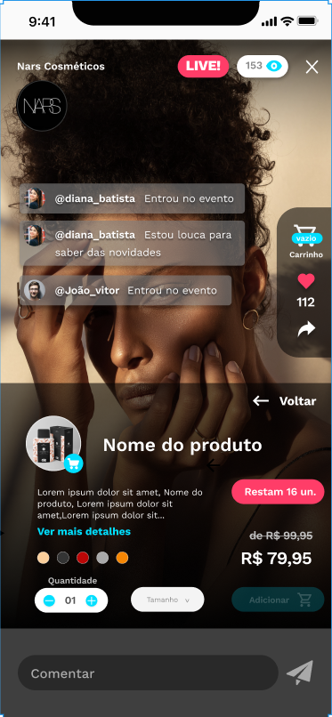
The biggest change added after the research was the in-stream shopping cart. Previously, when a customer clicked the buy button, they were taken to the shopping cart to choose product details. After the changes, the shopping cart was implemented without requiring users to leave the live stream, keeping the focus on the presentation without worrying about missing a product.
In-stream Cart Implementation
5. Monitoring
5.1 Development Wrap-up and Final Testing
- Roll out the new design in controlled phases to monitor its impact on performance metrics.
- Run A/B tests to validate the effectiveness of the changes.
- Collect user feedback for future improvements.
- Complete, up-to-date documentation.
Results
- Structured a scalable design system to ensure consistency across all digital products.
- Led the launch of a key feature that increased the company's revenue by 20%.
- Partnered with cross-functional teams to turn user insights into high-impact experiences.
Note: this is a summary of the project; some data and research were omitted at the company's request.