The Project
Summary of the Process
1. Color Palette
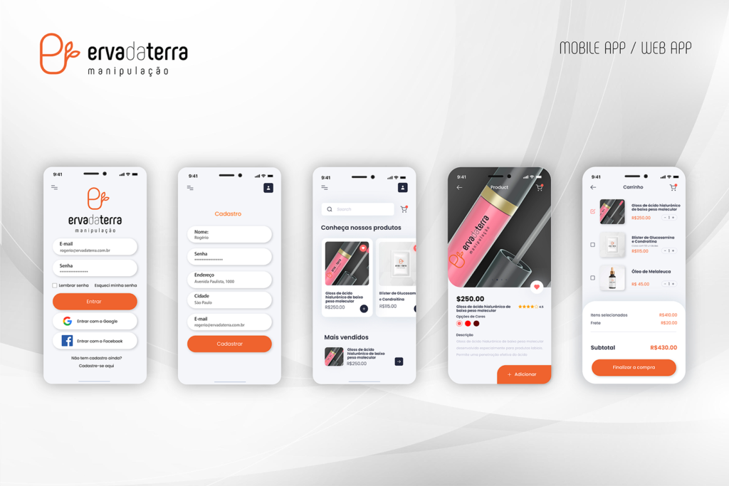
I used a color palette that conveys trust and calm, incorporating the brand's colors along with tones that reflect nature and the pharmacy's natural approach.
2. Intuitive Layout
I prioritized a simple, intuitive layout, highlighting the app's main sections, such as products, promotions and information about the pharmacy.
3. Features
Product customization: I integrated a customization feature, allowing customers to request specific formulas according to their needs. Order tracking: I implemented a real-time order tracking system to keep customers informed about the status of their purchases.
4. Clear Typography
I chose clean, easy-to-read typography to ensure essential information is communicated effectively.
5. Appealing Images
I used high-quality images that represent the quality and origin of the products, conveying a message of authenticity and trust.
Note: this is a summary of the project; some data and research were omitted at the company's request.